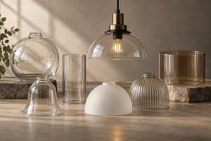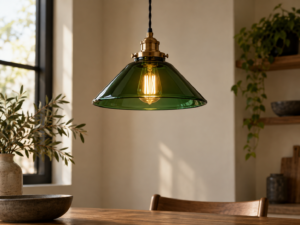
レストランの照明に最適なガラス色は、一般的なダイニングにはフロストホワイト(肌を美しく見せ、まぶしさがない)、バーや親密なダイニングにはアンバー(青みを抑えた温かみ)、ファストカジュアルやインダストリアルな内装にはクリア(最大の明るさ、フィラメントの見せ方)、カクテルバーやハイコンセプト空間にはスモークグレーです。すべて2700Kまたは3000KのLED光源と組み合わせて使用します。.
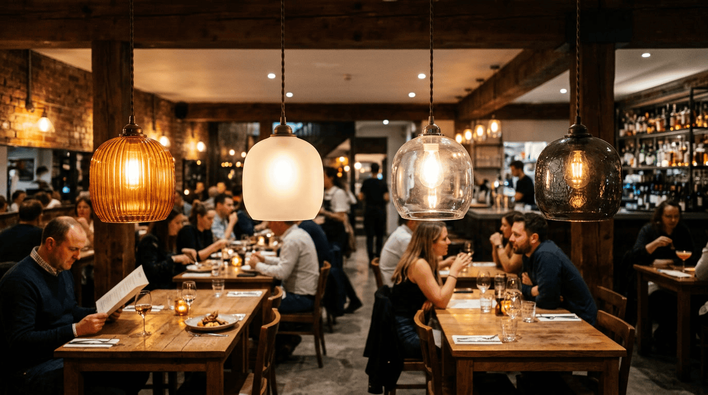
レストランのペンダントシェードのガラス色は、ホスピタリティ空間の設計で最も議論されることが少なく、最も影響力のある決定のひとつです。ガラス色は、料理、来店者の顔、部屋の表面に落ちる光の色を直接決定します。選択を誤ると、こだわって仕入れた食材が平坦に見え、肌色が冷たく無機質に見え、内装が作り出そうとした温かい雰囲気が、照明を点けるたびに損なわれてしまいます。.
このガイドでは、 レストラン照明に最適なガラスの色 — 各色が光に与える影響、料理や顔の見え方にとってなぜ重要なのか、そしてどのレストランコンセプトにどのガラス色が最適なのかについて。.
レストランに最適な光色は?
答えは、質問が混同している2つの要素によって決まります: 色温度 LED光源の色温度(ケルビンで測定)と、 ガラスシェードの色 その光源からの光をフィルタリングし、形作るガラスシェードの色です。.
標準 レストラン照明 ガイダンスは色温度に焦点を当てています:ファインダイニングには2700K、カジュアルダイニングには3000K、ファストカジュアルやクイックサービスには4000K以上。これは正しいですが、不完全です。2700KのLEDをフロストホワイトのガラスシェードを通して照らす場合と、アンバーのガラスシェードを通して照らす場合では、同じ2700Kでも光の質が異なります。アンバーガラスのスペクトルフィルタリングによって、光の出力が赤橙色寄りにシフトし、実質的には2400K以下の特性となります。.
光源の色温度とガラスシェードの色の相互作用を理解することが、真の雰囲気を生み出すレストラン照明と、単に問題を回避するだけの照明を分けるポイントです。.
料理や顔の見え方に影響する光色スペクトル:
- 2500K未満(非常に温かいアンバーオレンジ): キャンドルのような温かみを生み出します。顔や温色の料理(肉、パン、ロゼ)に最適。緑野菜や青みのある料理には不向きです。.
- 2700K(温白色): ファインダイニングの標準。温色の料理を正確に再現し、肌色を美しく見せます。レストラン照明に最も幅広く適した色温度です。.
- 3000K(ニュートラルウォーム): カジュアルダイニングやバーの標準。2700Kよりやや冷たく、依然として肌を美しく見せ、より幅広い料理に適しています。.
- 3500K以上(クールホワイト): 温かいダイニング環境には適していません。臨床的な印象を与え、どのレストランの雰囲気目標とも一致しません。.
引用された研究によると コーネル大学ホスピタリティ研究センター, 、暖色系のレストラン照明(3000K未満)は、実際の料理の質に関係なく、料理の質の知覚に対するゲスト満足度スコアを一貫して高めます。つまり、光自体が料理の体験を形作ります。.
レストラン照明のための6つのガラスカラー
フロストホワイトガラス:最も汎用性の高いレストラン用ガラスカラー
フロストホワイトガラスは、LED光源出力の75〜82%を色フィルタリングなしで透過します。フロストガラスを通した光の色は、基本的に光源の色温度と同一です。光源が2700Kの暖白色なら、室内照明も2700Kの暖白色になります。光源が3000Kなら、室内も3000Kです。.
フロストホワイトが様々なレストランコンセプトで機能する理由:
– 意図しない色の偏りがなく、光源の色温度の選択が室内の色温度を制御します
– 点光源のグレアを排除しつつ、高い照度を維持します
– どんなインテリアパレットにも視覚的な衝突なく対応します
– どのガラスタイプよりも一貫した料理の色再現性(スペクトルフィルタリングなし)
フロストホワイトガラスは、ガラスによるフィルタリングではなく、LED光源の選択によって照明の色をコントロールしたいレストランにとって、安全で信頼できる選択肢です。高級ダイニング、カジュアルダイニング、ファミリーダイニング、ホテルのダイニングルーム、料理の見た目の色精度が重要なあらゆるレストランに適しています。.
アンバーガラス:バーや親密なダイニングに最適なガラスカラー
アンバーガラスは赤やオレンジの波長を選択的に透過し、青色波長光(400〜500nm)を吸収します。その結果、光源の色温度よりもはるかに暖かく感じる光になります。2700KのLEDをアンバーガラスを通して照射すると、実質的に2200〜2400Kの範囲の光になります。.
アンバーガラスがバーや親密なダイニングに適している理由:
– バーカウンター席で顔を最も美しく見せる光を生み出します。暖色スペクトルが、標準的な白色光が顔に近距離で生じさせる青い影の不快な効果を抑えます
– アンバー色の飲料を劇的に輝かせます。ウイスキー、バーボン、ダークラム、アンバービール、ロゼ、熟成カクテルなどがアンバーシフトした光の下でより魅力的に見えます
– 生理的にリラックス効果があり、バーカウンター席での滞在時間を長く促します
– バー空間をメインダイニングルームと差別化する独特の視覚的雰囲気を作り出します
トレードオフ:アンバーガラスは光源出力の50〜65%を透過します。これはフロストホワイトよりも大幅に少ない値です。アンバーガラスシェードのバー用照明器具には、十分なバー表面照度(バー表面で150〜300ルクス、快適なドリンク準備やメニュー閲覧に適した明るさ)を得るために15〜20ワットのLED光源が必要です。.
クリアガラス:工業的・高エネルギー環境に最適なガラス色
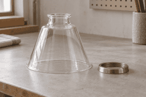
クリアガラスは、フィルタリングなしで光源出力の88〜92%を透過します。ランプ光源が完全に見えるため、ワットあたりの最大輝度と最大の視覚的エネルギーが得られます。.
クリアガラスがレストランのガラス色として最適な場合:
– 露出したフィラメントLEDが視覚的デザイン要素となる工業スタイルのレストラン
– 明るく活気のある雰囲気がテーブル回転率を促進するファストカジュアル環境
– 眩しさが問題とならない十分な高さ(目線より上)に設置されたバーカウンターの照明
– クリアガラスの開放的で軽やかな雰囲気がブランドコンセプトの一部となっている環境
クリアガラスの注意点: ダイニングテーブルのペンダント照明(テーブル面から28〜34インチ上)では、標準的なLEDチップを使用したクリアガラスは、向かい合って座るゲストに不快な眩しさを与えます。これはレストランでクリアガラスに関する最も一般的な苦情です。対策としては、フィラメントタイプのLED電球を使用することです。これにより、分散された低輝度の光が得られ、クリアガラス越しでもLEDチップアレイよりもはるかに眩しさを抑えることができます。.
スモークグレーガラス:ハイコンセプトバー&ラウンジの色
スモークグレーガラスは、わずかにクールなグレーの色合いで、ソース出力の35〜50%を透過するダークティントガラスです。結果として得られる光は次のとおりです。
– 同等のワット数で他のどのガラスタイプよりも低いルクス
– トーンがわずかにクール – 暖かいアンバーやニュートラルホワイトではなく、グレーのキャスト
– ドラマチックでミステリアス – ペンダントシェード自体はほとんど不透明に見え、下に発する光とは対照的な視覚的な重みを創り出します
スモークグレーガラスは、食品の色再現と十分な照度が重要な飲食店のダイニング空間には適していません。光の透過率が低すぎ、食品の色を不適切な方向に変えてしまいます。適した用途は、カクテルバー、ラウンジ席、雰囲気を重視するコンセプトバーです。アンダーバーLED、キャンドルライト、バックライト付き酒類ディスプレイなどの補助照明で、必要な照度を確保してください。
セージグリーンとコバルトブルーガラス:スペシャルティカラーのステートメント
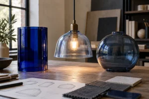
グリーンとコバルトガラスのシェードは強い色合いを生み出します – セージグリーンはクールで緑豊かなトーンをキャストし、コバルトブルーはドラマチックでクールなブルーの雰囲気を作り出します。色の効果は低い透過率(30〜50%)でも顕著であり、色の精度が重要な食品サービスには不向きです。.
光の色と食品の知覚に関する研究は、 マックス・プランク経験的美学研究所の科学者たち, によって指摘されているように、ピンクスペクトルの光は食品の甘さの知覚を高め、緑色の光は食欲のシグナルを減少させることが示されています。特定の感覚デザイン効果を追求するレストランはこれらの発見を意図的に使用していますが、これらは専門的な用途であり、一般的な推奨事項ではありません。.
セージグリーンとコバルトガラスのシェードは、すべての照明器具の主要なペンダントガラスの色としてではなく、バーの上の一つのステートメントペンダント、アートインスタレーション、またはシグネチャーポジションとして、特徴的な要素として最もよく機能します。.
オパールホワイトガラス:プレミアムソフトグローオプション
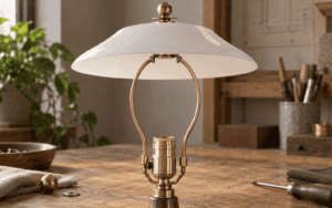
オパールガラス(ミルクガラス、60〜75%の透過率)は、フロストガラスよりも濃密で均一な白い外観を生み出します。点灯すると、オパールガラスのペンダントは内側から輝いているように見えます – 同等のルーメン出力でフロストガラスよりもプレミアム感のある視覚的な品質です。.
高級レストランのコンセプト – ファインダイニング、ホテルのダイニングルーム、高級カジュアル – では、オパールガラスのペンダントシェードは、フロストガラスにはない方法で品質と職人技をシグナルします。トレードオフはルーメン出力です:オパールガラスは、10〜15ワットのフロストガラスと同じテーブル照度を達成するために15〜20ワットのLEDソースを必要とします。.
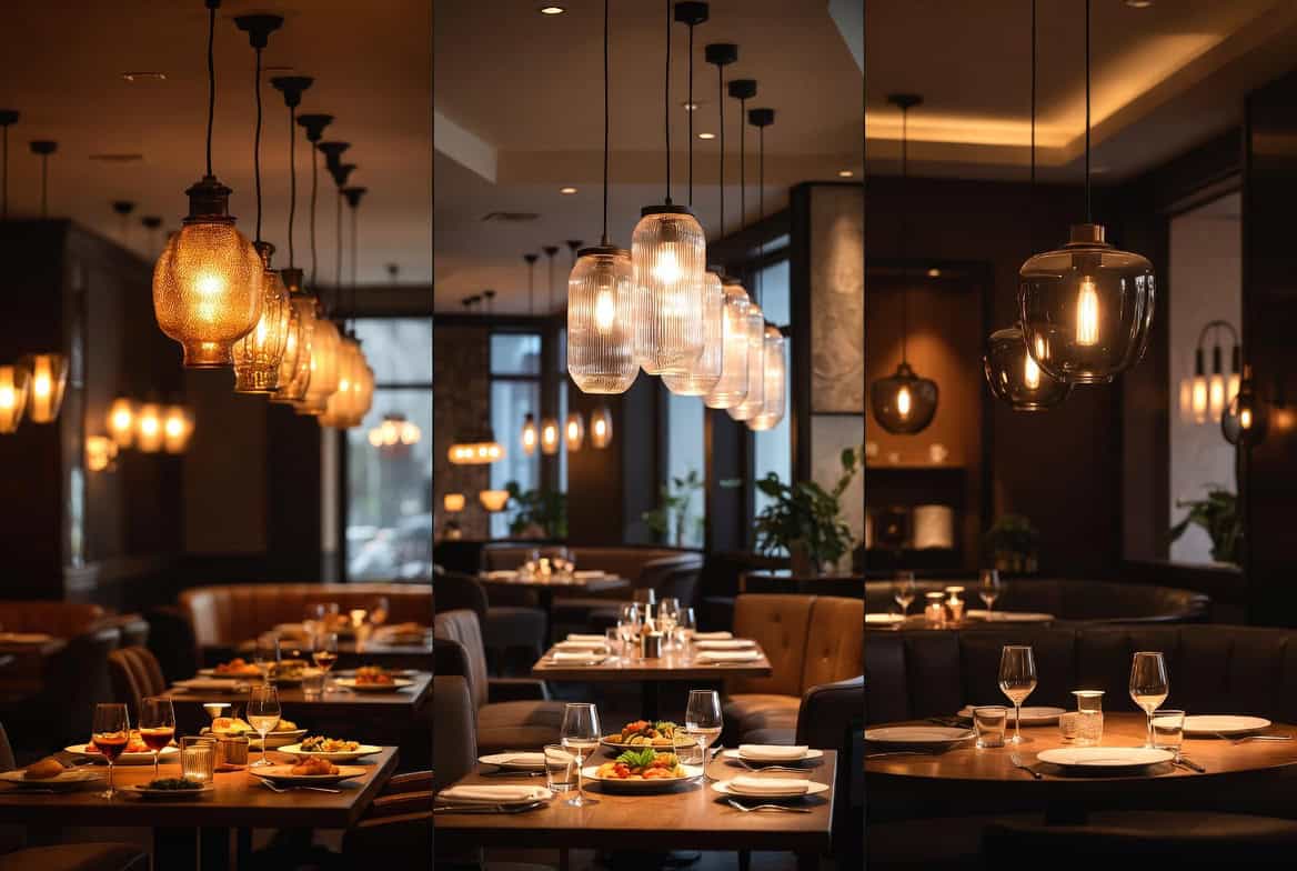
レストランコンセプト別のガラスカラー
レストラン照明のガラスカラー選択は、ダイニングコンセプトと収益モデルに直接対応します。
| レストランコンセプト | 最適なガラスカラー | 色温度 | 備考 |
|---|---|---|---|
| 高級レストラン | オパールまたはフロストホワイト | 2700K | 食品の最大演色性 |
| 上質なカジュアル | フロストホワイト | 2700K | 信頼できる万能型 |
| カジュアルダイニング | フロストホワイト | 3000K | 省エネと快適性のバランス |
| ファストカジュアル | クリアまたはフロスト加工 | 3000K | 明るさ=回転率 |
| フルバー(ダイニングエリア) | フロストホワイト | 2700K | バーのアンバー色を補完 |
| バーカウンター | アンバー | 2700Kまたは3000K | 顔と飲み物を美しく見せる |
| カクテルラウンジ | アンバーまたはスモークグレー | 2200〜2700K | 雰囲気重視 |
| カフェ(昼間) | フロストホワイト | 3000K | 生産性のバランス |
| カフェの夕べ | アンバー | 2700K | ラウンジモードへの切り替え |
| インダストリアルレストラン | クリア+フィラメントLED | 2200K | 美的要素 |
レストランにおけるガラスの色がフードフォトグラフィーに与える影響
現代のレストラン収益には、間接的ではあるが測定可能なソーシャルメディア写真からの貢献が含まれています。ゲストが生成するコンテンツは無料のマーケティングとして機能します。ガラスシェードの色は、写真に写る料理やレストランの雰囲気に直接影響を与えます。.
レストランの写真撮影に最適なガラスの色:
フィラメントLEDを備えた透明ガラスは“レストランのボケ”を生み出す。背景の暖かくぼやけた光点は料理写真の質と雰囲気を示す。この効果は透明ガラスとフィラメントLEDで最も劇的になり、すりガラスやオパールガラスでは再現できない。.
アンバーガラスは暖色の料理(コーヒー、パン、肉、菓子)を暖かいアンバー系の光の下で劇的に魅力的に見せる——写真は豊かに暖かく誘うように見える。しかし新鮮なサラダや緑を主役とする皿はアンバー光の下では食欲をそそりにくい。.
フロスト white は最もニュートラルな撮影用ガラスで、光質は写真の正確な食材の色再現に適しており、アンバーや透明ガラスの劇的なスタイル効果はない。正確な食品表現が雰囲気効果より重要なレストランに最適。.
以下に従って National Restaurant Association’s research on social media and restaurant marketing, 客が頻繁に写真を撮って食べ物の画像を共有するレストランは、視覚的なソーシャルメディアの存在感が強い相応のレストランに比べ、社会的チャネルを通じた顧客獲得が18–24%高くなる——照明の写真品質が直接的な売上要因になる。.
インテリアデザインパレットに合わせたガラスカラーのマッチング
グラスの色はインテリアのパレットと調和させる必要がある——LEDの色温度だけではなく——一貫した視覚環境を作るため。.
暖色系インテリア(木目、テラコッタ、暖色系金属):
最適なガラス色:アンバーまたは フロスト white。暖かいガラス色はインテリアの暖色を増幅させる。クール系ガラス(スモークグレー、3000K+ のLEDを用いたブレスド)だと暖材と冷光の視覚的葛藤を生み、調和を乱す。.
クールなインテリア配色(コンクリート、鋼材、石板、クールグレー):
最適なガラス色:クリアまたは 3000K の フロスト white、あるいはスモークグレー。ニュートラル〜クールなガラス色はクールな素材パレットと調和する。クール素材のインテリアにアンバーガラスを用いると、暖色と冷色の興味深い対比が生まれ、意図的なデザイン選択として機能することがある。.
エレクトリックまたは最大主義のパレット(暗い壁、宝石色、混合素材):
最適なガラス色は支配的なトーン次第。深い宝石調の内装には視覚的な暖かさを与えるためアンバーガラスが良く合う。グラフィックで高コントラストの黒と白の内装にはクリアまたは フロスト ガラスが合う。.
日本の Architectural Digest’s documentation on hospitality interior design, レストランの照明仕様で最も一般的な間違いは、 dominant パレットを強調するのではなく、それと対立するガラスシェードの色を選ぶことです。つまり、クールな素材のレストランには暖色系のガラス、暖かな素材のレストランにはクールなガラスを選ぶこと。.
2026年のレストランのガラス色の動向
アンバーガラスがフルサービスバーの標準化へ. かつては専門的またはアクセントの選択だった—バーのアンバーガラス—が、品質階層のレストラン群のフルサービスバー照明のデフォルト仕様になりつつある。アンバー色にシフトしたバー照明の生理学的・写真学的利点は、ホスピタリティデザインの関係者の間でよく理解されるようになった。.
カクテルバーからカジュアルダイニングへと広がるスモークとダークガラス。. スモークグレーのガラスは、純粋なカクテルバーの文脈を超え、ムード感があり、より際立つ雰囲気を求めるカジュアルダイニングやカフェバー環境へ移行している。.
フィラメントLEDを安定させるクリアガラス。. エジソン球をクリアガラスで用いるトレンドはピークを過ぎ安定化しており、工業風レストランの支配的な選択肢であり続けるが、新規出店比率としては成長していない。.
| ガラス色トレンド | 文脈 | 2026年の採用 |
|---|---|---|
| バーのデフォルトとしてのアンバーガラス | フルサービスバーのカウンター | 標準化の進行 |
| カジュアルダイニングのスモークガラス | カジュアル、カフェバー | 新興 |
| クリア/フィラメント安定化 | インダストリアル、ファストカジュアル | 安定した、確立された |
| プレミアムカジュアル向けオパール | 上質なカジュアル | 成長が遅い |
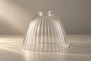
| リブ加工/質感のある専門 | コーヒー、クラフトホスピタリティ | 成長するニッチ |
よくある質問
レストランに最適な光色はどれですか?
2700Kの暖白色は、上質なダイニングと高級カジュアルレストランに最適な色温度です — 肉類、パン、ソースなどの暖かい食材の色を正確に再現し、肌のトーンを美しく見せます。3000Kは、カジュアルなダイニングやカフェに適しており、やや明るく活気のある雰囲気がコンセプトに合います。ガラスシェードの色は追加の制御層を提供します:アンバーガラスはLED源をより温かく変え、クリアガラスは源色をそのまま透過させ、フロストドホワイトはニュートラルです。.
レストランで食べ物を最も美しく見せるガラスの色はどれですか?
2700Kのフロストドホワイトガラスは、最も正確で魅力的な食物色再現を行います — 色の偏りを生じさせず、暖色系LED源が食物の赤・オレンジ系を強調します。アンバーガラスは温かい色味の食べ物(肉、ペストリー、コーヒー)を非常に魅力的に見せますが、緑色野菜やクール系の食べ物を強調して見せることは難しくなります。フィラメントLEDを採用したクリアガラスは、素晴らしい食物写真の条件を生み出します。.
レストラン照明にはアンバーガラスがフロストドホワイトより良いですか?
アンバー色のガラスは、雰囲気と近距離での face flattering を優先するバー・ラウンジ部分には フロスト white よりも優れている。フロステッドホワイトは、一般的なダイニング部門での食品の色再現性と眩しさの少ない快適な照明を優先する場合に適している。多くのレストランはダイニング部に フロスト white、バーには amber を使用しており、二つのガラス色がダイニングとバーゾーンの間で顕著な視覚的キャラクター変化を作り出す。.
レストランで煙灰色のガラスは何のために使われるのですか?
煙灰色のガラスは、ドラマチックで低照度のやや涼しめのトーンの雰囲気照明を生み出す——アンバー コクバー、ラウンジ席、ハイコンセプトのバー環境など、雰囲気が照度より優先される場面に適している。食物の視認性や色再現性が重要なダイニング表面には適していない。煙灰色のガラスペンダントは、適切な機能照明を得るために追加照明(バー下のLED、キャンドルライト、バックライトのボトルディスプレイなど)が必要。.
同じレストランで複数のガラス色を使用できますか?
はい — 多くのレストランのコンセプトでは、異なるゾーンに異なるガラス色を使用するのが適切な仕様である。フルサービスのレストランでは、ダイニング部に フロスト white、バーに amber、プライベートダイニングやラウンジエリアに smoke grey を用いる、という構成が一般的である。重要なのは意図性である:異なるゾーンに異なるガラス色を配置することで、計画的な雰囲気の変化を生み出す。一方、同じゾーン内でガラス色が不統一だと視覚的な整合性を欠く。.
ワインバーに最適なガラス色はどれですか?
2700K の amber ガラスまたは フロスト white は、ワインバーにとってどちらも優れた選択肢である。特に amber ガラスは、赤ワイン、ロゼ、琥珀色の蒸留酒の見栄えを高める。暖色側にシフトした光はワインの色をより輝かせる。2700K の フロスト white は、 amber が作り出す誇張を抑え、ワインの色再現を正確に行う。実際のグラスのワイン色を重要視するワインバー環境(本格的なワインバーなど)では、2700K の フロスト white がより正確である。.
ガラス色はレストラン照明のエネルギー消費に影響しますか?
はい、間接的に。透過率の低いガラスカラー(アンバー50–65%、スモークグレー35–50%)は、白色フロスト(75–82%)と比較して同等の照度を得るためにより高出力のLED光源が必要です。アンバーガラスを全てのペンダント照明に指定したレストランは、同じテーブル照明を維持するために、白色フロストの照明よりも20–40%高いLEDワット数が必要となります。これは長年の運営においてエネルギーコストに大きな差をもたらします。.
結論
日本の レストラン照明に最適なガラスの色 これらは普遍的な答えではなく、各ガラスカラーをその特定エリアの照明目的に合わせてゾーンごとに指定するものです。食事の見た目や快適さが重要なダイニングには白色フロストを。雰囲気や顔の印象を重視するバーカウンターにはアンバーを。ドラマやムードを重視するカクテルラウンジにはスモークグレーを。工業的なコンセプトの場所では、見えるフィラメントがビジュアルデザインの要素となるクリアガラスを使用します。.
この仕様を正しく設定することは装飾の決定ではなく、収益の決定です。各テーブルやバーの上のガラスシェードの色は、料理の見え方やゲストの感じ方、滞在時間に影響します。.
白色フロスト、アンバー、スモークグレー、オパール、クリアガラスのレストラン用ガラスシェードカラーは、商業ホスピタリティ用途の標準フィッターサイズ全てに対応し、, jxlampshade.comのガラスランプシェード製品ライン 完全なレストランの内装に合わせたバッチを供給し、ガラス仕様を記録しています。.